The UX Sweet Spot: Balancing Beauty and Usability in Digital Products
Ever landed on a stunning website and had no idea where to click? Or opened an app that worked perfectly but looked like it was designed in 2008?
That, friends, is what happens when you miss the UX sweet spot—the magical intersection where beauty meets usability. It's not about making things pretty or functional. It's about making them both, without sacrificing one for the other.
In 2025, users expect thoughtful design and seamless functionality. Not one, not the other. Both. So let’s talk about how to hit that sweet spot—and keep your digital product from being just another forgettable interface.
First, What Is Good UX, Really?
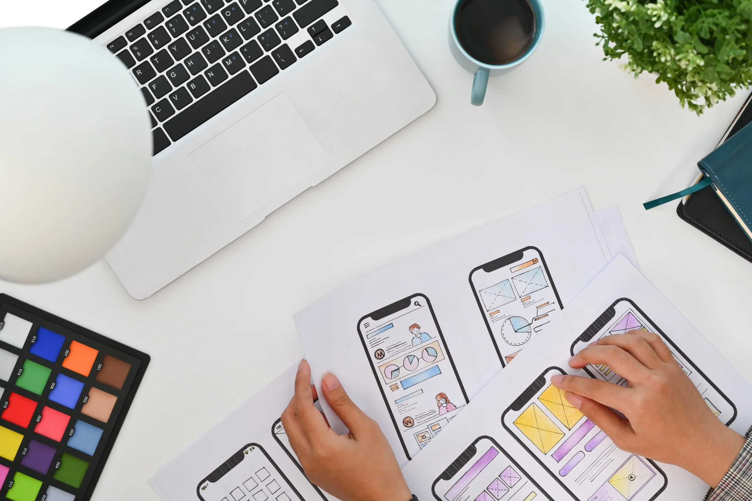
UX (user experience) is not just wireframes, flows, or fancy Figma files. It’s the feeling your product leaves behind. The ease. The clarity. The “that was painless” moment.
Good UX does three things:
Solves a real problem
Guides users effortlessly
Feels like it was designed just for them
Now add in visual design—and suddenly, it’s not just easy. It’s delightful.
Why Beauty Without Usability Fails
A gorgeous app that confuses people = frustration.
A minimalist site that hides essential buttons = rage clicks.
Design trends come and go, but confusing your users never goes out of style.
Common offenders:
Overly abstract icons (what does that squiggle even mean?)
Low contrast text that looks cool but is unreadable
Loading animations that last longer than a microwave burrito
Navigation that’s more “treasure hunt” than tool
Why Usability Without Beauty Fails
Yes, you could build a perfectly usable app with no styling.
But would anyone want to use it?
Visual design is how users decide if your product is credible, trustworthy, and worth their time—often within seconds.
Ugly might be functional. But beautiful and functional is what builds brands.
Bonus: beautiful design isn’t just aesthetics—it reinforces hierarchy, guides the eye, and boosts perceived ease of use. (Yes, there’s research to back that up.)
The UX Sweet Spot: Our Recipe
At Carried Away Creative, we aim for digital experiences that are easy to use and hard to forget. Here’s our not-so-secret formula:
1. Design With the User’s Brain in Mind
Clear paths, consistent patterns, obvious next steps
Don’t make users guess (or worse, Google how your app works)
2. Use Visuals to Reinforce Function
Color, type, spacing = tools for clarity
Every design element should serve a purpose
3. Prioritize Mobile UX
It's not “mobile-first” anymore—it’s mobile-always
Test on thumbs, not just cursors
4. Test With Real People
Not just your team. Not just your client.
Real users. Real feedback. Real gold.
5. Embrace Simplicity—but Not Boredom
Don’t overwhelm. But don’t underwhelm either.
Delight doesn’t require confetti cannons—just thoughtful details.
TL;DR: Form + Function = Success
Beautiful design gets attention.
Usable design earns trust.
Great UX does both.
If your product feels like a museum piece or a filing cabinet, it’s probably time to recalibrate. And we can help.
Ready to find your UX sweet spot?
Let’s create something extraordinary, together.